
CJEDEVITA // Identity, Branding
from iscijediti, Bosnian - to squeeze out + vita, Latin - life, essence
Cjedevita—Organic Fresh Squeezed Juice:
the idea was to create fun, vibrant, and eye catching
visual identity
that would translate and communicate across variety of media.
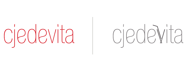
1. LogoMark

2. LogoType
based on Helvetica Thin Condensed
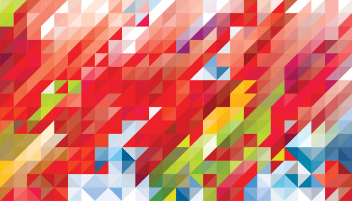
3. Pattern design
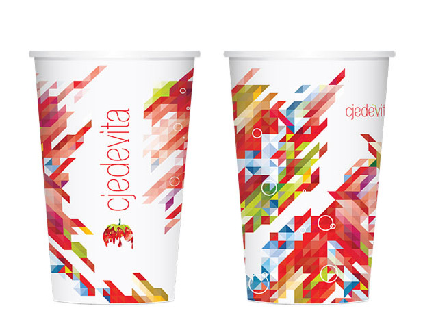
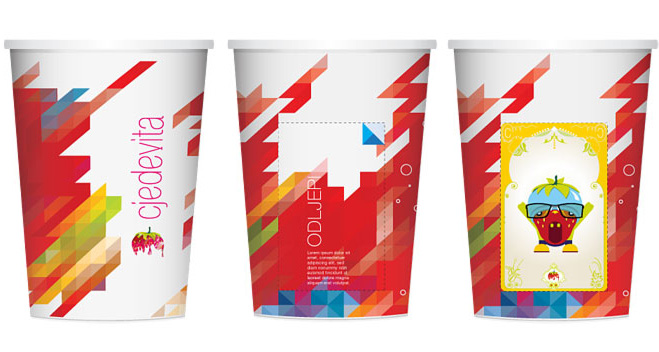
4. Paper cup // adult
4. Paper cup // kids
with peal-off sticker and collectable card
6. Samples collectable cards
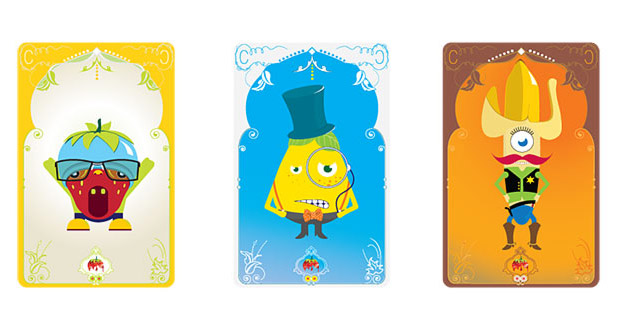
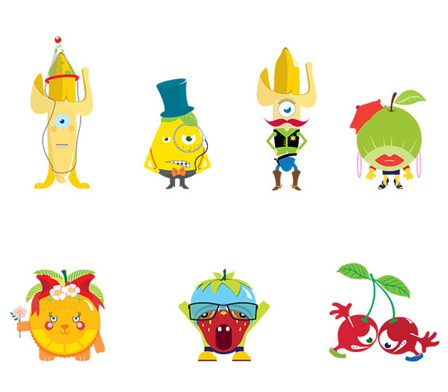
7. Character design